Tech Hop has been a fun exploration into video game design. In this blog post we are going to talk about designing the UI/UX to fit our up and coming game. It's always fun trying to figure out what design will work best with our games. Sometimes it will take a few trials and errors, but that is why its always good to concept out your art first.
In this case we are going to do a Sci-Fi style UI/UX. Our game Tech Hop is a endless runner with a Sci-Fi theme. The game is simple and made for general audiences of all ages. Since this will be played from everyone to young children to adults, we wanted to make sure our User experience is easy to navigate.
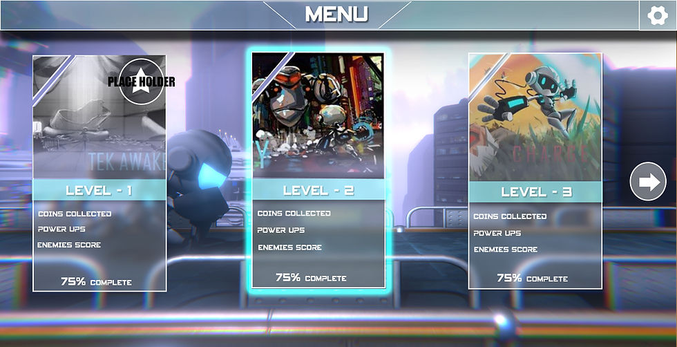
First lets talk color scheme, we looked at adobecolor.com and Tech Hop's concept art to figure out our color scheme for our User Interface. We chose the blue and white for our color scheme for the menu. The tools we used are Photoshop and Unity 3D. In most cases you don't want to use too many colors in your scene or it can make your scene look busy. When the player hovers over the level it will have a glow highlight behind it to indicate that it is selected.
We chose the common card design, you may have seen this in a lot of games due to it's clean look and the fact that it's easy to navigate around. As you can see the player can just tap or click the levels to get started in the game. The ratio or resolution we chose can work across most platforms including mobile and even 4K TVs. I left some breathing room on the bottom just in case we want to add more menu features. The font we chose was a free font called Spy Agency you can get from Dafont.com. As you can see we put the name of the levels on the blue strip. When the player hovers over the level it will have a glow highlight behind it to indicate that it is selected.
Now for the background! For our background we thought we would make it dynamic by animating the background. This will give our background a nice dynamic look. Having the main character Tech Hop run in the background will give the player a nice impression of the art they will see in the game. We created the background animations in a separate scene in Unity 3D and had the 3D assets repeat. We plan on having the background change as the player progresses in the game.
Here are some tips on creating UI/UX for your game or app
Always check out references on Pinterest and Google Image search
Always ask yourself, "will I be able to navigate this? Can a stranger navigate this User Interface with no instructions?"
Test with your peers, have people who never played your game use your User Interface.
Check out other games with nice clean User Interfaces or games that fit the style of the game you are working on.
Use AdobeColor.com to find your color scheme
Add cool sounds to your UI Experience. If someone clicks or taps a button add a nice sound to let them know they clicked or tapped on the UI element.
Ad highlights to let your User know they tapped or clicked an element.
Adding animation to your background is cool, but make sure its not too busy.
Create more than once style and have others give you feedback and suggestions.
Stay tuned for more from our Tech Hop blog. We plan on talking about music, art and game design in the future. If you like what we do feel free to buy us a cup of coffee we will really appreciate it. It will help us complete a lot of our cool projects and Unity 3D tools.


Comentarios